Thursday, December 15, 2011
Wednesday, December 14, 2011
Wednesday, November 16, 2011
Landscape Assignment Final
Title: Danielson - LS Sunset
Date: 10/31/11
Location: Just off of Arden HWY
Time of day: 5:45pm
F/stop: f/13.0
Shutter speed: 1/80
ISO: 100
Title: Danielson - LS Field
Date: 10/31/11
Location: Arden HWY
Time of day: 6:00pm
F/stop: f/13.0
Shutter speed: 1/40
ISO: 100
Title: Danielson - LS Clouds
Date: 11/1/11
Location: Just off of Dick RD
Time of day: 5:30pm
F/stop: f/22.0
Shutter speed: 1/125
ISO: 100
Title: Danielson - CU Leaves
Date: 11/1/11
Location: Hillsboro Public Library
Time of day: 5:45pm
F/stop: f/3.5
Shutter speed: 1/30
ISO: 100
Title: Danielson - CU Flower
Date: 11/2/11
Location: Just off of Evergreen RD
Time of day: 5:45pm
F/stop: f/5.6
Shutter speed: 1/25
ISO: 100
Date: 10/31/11
Location: Just off of Arden HWY
Time of day: 5:45pm
F/stop: f/13.0
Shutter speed: 1/80
ISO: 100
Title: Danielson - LS Field
Date: 10/31/11
Location: Arden HWY
Time of day: 6:00pm
F/stop: f/13.0
Shutter speed: 1/40
ISO: 100
Title: Danielson - LS Clouds
Date: 11/1/11
Location: Just off of Dick RD
Time of day: 5:30pm
F/stop: f/22.0
Shutter speed: 1/125
ISO: 100
Title: Danielson - CU Leaves
Date: 11/1/11
Location: Hillsboro Public Library
Time of day: 5:45pm
F/stop: f/3.5
Shutter speed: 1/30
ISO: 100
Title: Danielson - CU Flower
Date: 11/2/11
Location: Just off of Evergreen RD
Time of day: 5:45pm
F/stop: f/5.6
Shutter speed: 1/25
ISO: 100
Title: Danielson - CU Blackberry Leaf
Date: 11/2/11
Location: Just off of Evergreen RD
Time of day: 6:00pm
F/stop: f/3.5
Shutter speed: 1/30
ISO: 100
Wednesday, November 9, 2011
Q2W2 - Architectural Photography.
I think that architecture is more about imagination. All the different perspectives and colors all depend on who's shooting the photo. Every person has a big difference in style with architecture photography.In landscape photography people could have similar images, but in architecture photography they are more different.
I am a little nervous about the architecture project. Because I don't have a very good imagination when it comes to photography (in my point of view). The places I'm thinking of shooting are the cities in downtown portland, I don't know where exactly yet though.
URL: http://www.smashingapps.com/wp-content/uploads/2009/03/opendoorpolicy.jpgPhotographer: AN Jay
I like how this photo looks like a chess board. I also like how it looks like a castle.
URL: http://creativefan.com/files/2011/03/modern-architecture-26-500x400.jpg
Photographer: Eric Shafer
I like how this photo looks like a reflection but it isn't. I like how he captured the imagination.
URL: http://t3.gstatic.com/images?q=tbn:ANd9GcSGqdcs-6Nf-e_CK2m80zUvc0wbxbhbFcz1PD3CgagE_tA-kK66_VDDnNJoxQ
Photographer: Didn't say
I like the reflection. I also like the blues and whites.
URL: http://www.smashingapps.com/wp-content/uploads/2009/03/athens-olympic-complex.jpg
Photographer: AN Jay
I like all the colors in this photo. I also like the reflection.
URL: http://media.smashingmagazine.com/wp-content/uploads/2010/04/architecture42.jpg
Photographer: Noupe
I like his imagination for this photograph. I also like how he made it black and white to make it look older.
URL: http://webdesignledger.com/wp-content/uploads/2010/03/architecture_photography_13.jpg
Photographer: Henry Jones
I like how it looks like a spiral. I also like the repeating design.
URL: http://webdesignledger.com/wp-content/uploads/2010/03/architecture_photography_7.jpg
Photographer: Henry Jones
I like how it looks like a bridge. I also like the shadow it casts.
URL: http://media02.hongkiat.com/architectural-photography/architecture_26.jpg
Photographer: Julia Morgan
I like the distortion of the photo. I also like the colors.
URL: http://www.designzzz.com/wp-content/uploads/2010/08/17.jpg
Photographer: Designzzz
I like how it looks like a seashell. I also like the colors.
URL: http://www.cityofsound.com/photos/uncategorized/2007/05/30/greenberg1.jpg
Photographer: Stanley Greenberg
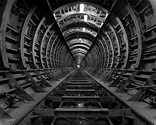
I like how it leads you into the photo. I like how its the same the whole way down.
Wednesday, November 2, 2011
Q2W1 - Landscape Photographers.
The person I was assigned is Bob Hudak and the photo's I found were mainly black and white (except for one). As for the areas he shoots in, it's mainly nature. The style is kind of a what's around the corner thing. The subjects for these photos is nature and the color is black and white the way he frames it is to capture all of the main object and leading your eye to wonder whats around the corner.
I really like the picture above because of the texture and all the lines.
I like this picture because of the reflection and the trees and I think that it has the repeating element.
I like how this picture gives a deep depth of field.
I like how this picture isolates the leaves with the black background.
I like how this picture the captures movement of the water.
I like how this picture is pretty plain with just the crack in the middle of the floor.
I like how the sky in this picture looks like its turning into a black hole.
I like this river in this picture and how this picture makes you wonder what's around the corner.
I like how this picture is also kind of plain but it looks like the sky is bending.
I like how the water in this picture is so smooth.
Wednesday, October 26, 2011
W10 - Landscape Locations
The two places i'm thinking of shooting photo's are the Hillsboro Public Library, and around my house. At the library there is a nice fountain and pound, plus there are geese and swans. There are lots of hills and fields and not very much civilization. There is lots of life and trees in both locations. For my wide angle photo's I'll probably shoot at the fields around my house, there's lines and and good colors. For my close-ups I'll shoot around the pond at the library. At the library I might shoot something in the water or maybe something in the tree's.
Wednesday, October 19, 2011
W9 - Landscape Exercise
This is my photo that is focusing on one prominent element.
ISO:200
Aperture:f/13.0
Shutter speed:1/160
Date:10-17-11
Location:Outside PAA
I shot this photo of the sun and thought it was one of my better ones. I would do the same next time. I like how it looks like there is a person. In photoshop I did a little curving to it.
This is my photo of the repeating elements.
ISO:200
Aperture:f/13.0
Shutter speed:1/160
Date:10-17-11
Location:Outside PAA
I took this photo focusing on the grass and thought it looked pretty good. I would do the same next time. I like the one shadow that the bush makes. I did a levels and made it a little darker.
This is my photo focusing on the sky.
ISO:200
Aperture:f/13.0
Shutter speed:1/160
Date:10-17-11
Location:Outside PAA
This photo was focusing on the sky and I like how there is just a few clouds. I would do the same next time. I really like how there are a few clouds in the background. In photoshop I did levels and made it darker and the sky more blue.
ISO:200
Aperture:f/13.0
Shutter speed:1/160
Date:10-17-11
Location:Outside PAA
I shot this photo of the sun and thought it was one of my better ones. I would do the same next time. I like how it looks like there is a person. In photoshop I did a little curving to it.
This is my photo of the repeating elements.
ISO:200
Aperture:f/13.0
Shutter speed:1/160
Date:10-17-11
Location:Outside PAA
I took this photo focusing on the grass and thought it looked pretty good. I would do the same next time. I like the one shadow that the bush makes. I did a levels and made it a little darker.
This is my photo focusing on the sky.
ISO:200
Aperture:f/13.0
Shutter speed:1/160
Date:10-17-11
Location:Outside PAA
This photo was focusing on the sky and I like how there is just a few clouds. I would do the same next time. I really like how there are a few clouds in the background. In photoshop I did levels and made it darker and the sky more blue.
Tuesday, October 18, 2011
Week 4 - Summary
We learned more about aperture, shutter speed, and ISO. We also learned a little bit about surface properties. I learned that aperture affects light and depth of feild. The shutter speed affects light and motion. ISO affects the camera sensativity to light, but the higher you set the ISO the more grainy the picture looks. I also learned that the standard in general for printing is at least 300res. For the web computer screen the res. should be at least 72. You can always down res. an image smaller and still be high quality, but you can't up res. an image bigger and still have the same quality.
Week 3 - Wednesday
In class we have been talking about different things we look for in a picture and the settings on cameras. We have talked about the rule of thirds and how it should be divided into a 3x3 grid. Also we've talked about geometric shapes like triangle, square, and circles. The main settings we talked about on the camera are the aperture (A), Shutter speed (S), And Auto (Auto) usualy spelled in green. In the aperture setting you get to decide the aperture and the camera decides the shutter speed, in the shutter speed setting you decide the shutter speed and the camera decides the aperture, auto is where the camera decides everything. We also talked about the trifecta in photography. The trifecta is ISO, aperture, and shutter speed. ISO is the cameras sensitvity to light, aperture is the size of the opening of the lens when a picture is taken, and shutter speed is how fast the shutter opens and closes.
Juxtaposition to me means two things that complement each other. In photography this can be applied many ways like a certain color that looks good next to another color.
 I like this picture because I like eagles, like the lighting, and also like how clear it is.
 I really like how all the colors blend in this picture and I also like the texture.
 I like how the water reflects the clouds and mountains. I also like how the clouds are nearly black with a little red and blue. I think the lighting in this photo is perfect.
Juxtaposition to me means two things that complement each other. In photography this can be applied many ways like a certain color that looks good next to another color.
When I first see a photo I look at the blen of colors and aperture, then look at the lighting. I really like animal photos I don't know why I just love the animals I guess. Below are some photos I found online that I like.
Thursday, October 13, 2011
Week 8 'Visual Elements of Fall'
Aperture:F/11.0
Shutter speed:1/25
ISO:200
Location:Back entrance of PAA
Date:10/10/11
Description:I saw these bushes in a circle and thought it had great shape and form. I made it a little darker in photoshop.
Aperture:F/3.5
Shutter speed:1/60
ISO:200
Location:Back side of PAA
Date:10/10/11
Description:I saw this single grape on the rock and thought that it might make a good picture. I made it a little brighter and cropped it.
Aperture:F/11.0
Shutter speed:1/25
ISO:200
Location:Mr. Johnson's garden at PAA
Date:10/10/11
Description:I liked the texture and all the raindrops on the leaves. I made it a little darker and cropped it.
Aperture:F/5.0
Shutter speed:1/60
ISO:200
Location:In the middle of PAA
Date:10/10/11
Description:I really liked the form of this picture. I brightened it a little.
Shutter speed:1/25
ISO:200
Location:Back entrance of PAA
Date:10/10/11
Description:I saw these bushes in a circle and thought it had great shape and form. I made it a little darker in photoshop.
Aperture:F/3.5
Shutter speed:1/60
ISO:200
Location:Back side of PAA
Date:10/10/11
Description:I saw this single grape on the rock and thought that it might make a good picture. I made it a little brighter and cropped it.
Aperture:F/11.0
Shutter speed:1/25
ISO:200
Location:Mr. Johnson's garden at PAA
Date:10/10/11
Description:I liked the texture and all the raindrops on the leaves. I made it a little darker and cropped it.
Aperture:F/5.0
Shutter speed:1/60
ISO:200
Location:In the middle of PAA
Date:10/10/11
Description:I really liked the form of this picture. I brightened it a little.
Aperture:F/11.0
Shutter speed:1/25
ISO:200
Location:Parking lot at PAA
Date:10/10/11
Description:I saw this puddle and the colors reminded me of fall.
Thursday, October 6, 2011
Week 7 summary
I liked going out and shooting fall images it was lots of fun. Focusing on the things Mr. Long told us to helped me find what I pictures I should take. I also learned how to use photoshop better.
Week 7 "Five Fall Images"
Aperture: F/11.0
Shutter speed: 1/125
ISO: 200
Location: Back of PAA
Oct. 5,2011
Aperture: F/11.0
Sutter speed: 1/30
ISO: 200
Location: Back of PAA
Oct. 5,2011
Aperture: F/11.0
Sutter speed: 1/125
ISO: 200
Location: Back of PAA
Oct. 5,2011
Aperture: F/11.0
Shutter speed: 1/40
ISO: 200
Aperture: F/11.0
Shutter speed: 1/200
ISO: 200
Location: Back of PAA
Oct. 5,2011
Thursday, September 29, 2011
Monday, September 26, 2011
Week 6 photographs
My pictures:ISO
ISO:100
Shutter speed:1/125
ISO:200
Shutter speed:1/125
ISO:400
Shutter speed:1/125
ISO:800
Shutter speed:1/125
ISO:1600
Shutter speed:1/125
ISO:100
Shutter speed:1/125
ISO:200
Shutter speed:1/125
ISO:400
Shutter speed:1/125
ISO:800
Shutter speed:1/125
ISO:1600
Shutter speed:1/125
Subscribe to:
Comments (Atom)


